Why I don’t believe that signs with fatality numbers cause more crashes
In a paper in Science, Jonathan Hall and Joshua Madsen proposed that dynamic signs that reported Texas road fatalities - “1669 deaths this year on Texas roads” - caused more accidents and fatalities.
Recently, a friend mentioned the paper to me. I replied that I had seen the paper but didn’t believe the result. I wasn’t going to ignore the finding, but I would update my beliefs in only the smallest of ways.
He asked how I’d come to that conclusion. In answering I stated that I had spent half an hour with the paper and supplementary materials over breakfast, clicking through to some of the paper’s references. He then questioned whether I had been too hasty.
I come to conclusions like this all the time. I am not going to read in detail 95% of the papers that might be of interest to me. I can’t. But I’m of the view that a quick peruse - and sometimes even a one sentence description of the paper - are a basis to start considering whether there it is a result that should lead me to update my world view.
So, I decided to write down the thought process that led to my conclusion. Years ago when I first started consuming scientific literature I was too gullible, often accepting results as presented. Now I worry that I have become the cynic who shouts “replication crisis” or “garden of forking paths” every time I see a new paper, once again failing to distinguish the good from the bad. Writing this post served as a chance to reflect on whether I had gone too far.
Below are my observations based on the initial half-hour peruse of the paper, the supplementary materials and some of the references, and another hour or so of contemplation of the results while I walked. I wrote the first draft of this post before going back to the paper. That took a couple of hours. I then revisited the paper and references to confirm my memory (no errors, but that’s not always my experience in cases like this), grab some specific details, and pull links, quotes and images for this post.
One day I might read the paper and references carefully to test whether I should update any of the below, although that is unlikely to change my conclusion materially as my arguments are not that there is anything wrong with the paper. Rather, my observations are based on the framework in which this paper was completed, the proposed mechanism and the broader literature.
On that point, this post should not be read as a critique of the paper. I haven’t put in the work required to do that properly. And if it was me developing this research, I would have done a worse job.
Below I briefly present the paper’s results. My following points then have two themes: the first being about how much faith we should put in empirical work of this nature, the second relating to the specifics of the paper.
Paper results
The paper concerns dynamic road safety signs on Texas roads. The signs can be programmed to show different messages, be they messages about the condition of the road ahead (e.g. the presence of an accident) or generic safety messages. Sometimes those messages would be about fatality counts. The presence of safety messages with fatality counts at some times but not others is what enables the experiment.
The abstract reads as follows:
Although behavioral interventions are designed to seize attention, little consideration has been given to the costs of doing so. We estimated these costs in the context of a safety campaign that, to encourage safe driving, displays traffic fatality counts on highway dynamic message signs for 1 week each month. We found that crashes increase statewide during campaign weeks, which is inconsistent with any benefits. Furthermore, these effects do not persist beyond campaign weeks. Our results show that behavioral interventions, particularly negatively framed ones, can be too salient, crowding out more important considerations and causing interventions to backfire — with costly consequences.
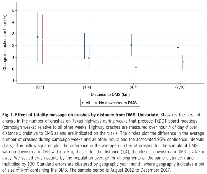
The paper contains several charts capturing the effect over the year, across years and by distance. The following shows the accident rate over the following 10 kilometres.
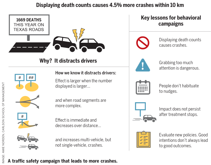
The Research Summary summarised the results as follows, including the following infographic:
We used instrumental variables to recover the effect of displaying a fatality message and document a significant 4.5% increase in the number of crashes over 10 km. The effect of displaying fatality messages is comparable to raising the speed limit by 3 to 5 miles per hour or reducing the number of highway troopers by 6 to 14%. … The social costs of these fatality messages are large: Back-of-the-envelope calculations suggest that this campaign causes an additional 2600 crashes and 16 fatalities per year in Texas alone, with a social cost of $377 million per year.
The meta-view
My starting point is my perspective on research of this kind. There are tens of thousands of academics (maybe an order of magnitude more?) coming up with ideas for analysis of observational data. The key to getting published in a “good journal” is to find some clever natural experiment or instrument by which to identify an interesting causal effect.
To get a sense of the scale of this endeavour, you only need look at what happens when a particularly prospective situation for a natural experiment occurs. Heath and friends found papers testing 114 outcomes using variation in business combination laws, by which different U.S. states have sought to constrain takeover activity. Similarly, they found over 80 papers testing 434 outcomes using the Regulation SHO pilot, a randomised controlled trial conducting by the U.S. Securities and Exchange Commission.
This is only the tip of the iceberg. Beyond the 80 public papers involving the Regulation SHO pilot, how many other academics have access the data, had a play or run some analysis? What is the total universe of analyses that has been run? I expect it an order of magnitude more than the 80 public papers.
And that hints at the problem. The statistical framework that typically underpins the reporting of results loses its validity if we don’t see all the analyses. Researchers look for results that pass the test for “significance. Results are declared”significant” if a statistical test shows that data as extreme as that observed has only a 5% probability or less of occurring if the hypotheses that there is no effect is true. If we see only a subset of the results, then we cannot say that we were unlikely to see those results if the hypothesis of no effect were true.
This isn’t just a problem when people all look at the same data as for the Regulation SHO pilot. If many people run many studies on many different datasets and we only see a subset of the results, we still have a publication bias problem. And this is ultimately reflected in the evidence of publication bias in empirical work of this nature (for example).
This paper on fatality messages causing road accidents was published in Science. I doubt it would have been published in Science if the authors hadn’t found an effect. I would give over 95% probability that I would not have heard of this paper if the result was simply no effect. There are other papers on these safety messages, so it may have been published somewhere, but not somewhere of the profile of Science.
This point alone is responsible for a large discount in how much I should believe the result in the paper is a true effect. The same problem contributed to the replication crisis across the social sciences. We don’t see a replication crisis with this empirical work on observational data as it’s not easy - and often impossible - to replicate it. But that doesn’t make the problem any smaller.
Ultimately, it’s hard to absolve an individual piece of research from this problem. It doesn’t matter how many robustness tests are conducted. Rather, you need to move from a perspective of looking at papers to looking at literatures, and then looking at those literatures with a an understanding that the literature is not representative of the full body of research (see Slate Star Codex for a great example of a literature contaminated with dodgy results involving 5-HTTLPR). And as I will discuss further below, I don’t yet see that supporting literature.
One potential mitigation arises before the study. If you have an idea and a possible dataset to test it, pre-register it. Then we start to get a sense on the universe of analyses that are out there but we never see. But pre-registration is tough with observational data and rarely done. (One recent review found only one example in economics.) You don’t know what form those data are going to be in and what problems you will find. (There will be problems.) Unless you are a domain expert with previous experience with data of that kind, you will likely have to iterate your hypotheses and analysis. But that doesn’t mean a first cut plan is of no use.
Alternatively, for this particular empirical phenomena, you could run a randomised controlled trial whereby the fatality count messages are shown at random times across random signs - if you could get a traffic authority to agree to the trial. That should also be pre-registered.
I find discounting such a broad swathe of empirical results in this way somewhat depressing. But I’m as comfortable doing that as I am discounting experimental behavioural science papers built on weak theory, small samples and no pre-registration.
The garden of forking paths
That previous point applies across studies. But within studies, the many degrees of freedom that typically exist within the analysis can also undermine the validity of the statistical approach.
If the authors try many different analytical approaches and we don’t see them all, this introduces a problem similar to the publication bias highlighted above. Then researchers might also try only one analytical approach, but to the extent this is chosen with an eye to getting the desired result (consciously or not), we again have a problem.
This point isn’t about deliberate misconduct. Researchers might see their work as iterating toward an analytical approach or choosing a path of analysis that makes sense. But the fact the chosen methodology is not random or representative of the full universe of possible analyses, the assumptions underpinning the statistical analysis no longer hold.
It’s not hard to see the many degrees of freedom in this particular paper. The analysis comparing crashes in weeks where the message was displayed to weeks when it wasn’t looked at accidents within the following buckets: 0km-1km, 1km-4km, 4km-7km and 7km-10km. Why were these buckets chosen? How to they compare to a series of 2km wide buckets? If there was nothing in the 7km-10km bucket, would it have been included in the paper? Were accidents beyond 10km analysed and we’re not seeing them because there is nothing there? Would the 0km-1km bucket have been combined with the next if it showed no effect? Similarly, for the analysis that introduced a series of controls, why were 3km, 5km and 10km chosen?
Then there is the analytical strategy. There are many possibilities here. The main paper contains both a strategy comparing across weeks and one with many controls. The comparison across weeks has a version in the supplementary material with more ambiguous results. Which would have been used in the main paper if the latter showed a larger effect? (More on that analysis in the supplementary material below.)
There are plenty of other points in the analysis where you can see the forking paths. We are only seeing a small subset of the analytical approaches that are possible. Many tests for robustness are shown, but this is also only a subset - and again, why that subset? What other analyses could have been run?
One point that makes this argument salient for me is that the p-values for the major analyses, although mostly below 0.05, are above 0.01. It’s tended to be experiments with p-values in this sort of range that have fared particularly poorly in the replication crisis across psychology and other social sciences.
As for publication bias, one before the fact solution to this garden of forking paths is a pre-analysis plan. But there is also a chance here to get a sense of the garden of forking paths after the fact. The data are publicly available. Over time, other researchers might dig into these data and try other specifications. A multiverse analysis might be one approach. Maybe we’ll then get a sense of the effect of all those forking paths. (My instinct is that even with a multiverse analysis something would still be there.)
Alternative analyses
Here’s one additional point on the multiverse of possible analyses.
A challenge with this paper was finding stretches of road with which to compare those stretches downstream of the signs.
One way to do this, in what the authors call the univariate analysis, is to compare the same stretch of road at times with or without the safety message. However, this leads to a potential confound as there may be variation between those times for reasons other than the message on the sign.
An alternative methodology would be to compare stretches of road immediately before and after the sign. The authors do this and report the result as follows:
All but one of the downstream estimates is >0, with a 1.7% increase over the (7–10] km downstream of DMSs (P = 0.018).
That “but one” with a decrease is the 0km-1km range, which should be range in which we are most likely to see a positive effect. This sentence describing the result is storytelling about noise in a way to imply it supports the hypothesis. This particular analysis is admittedly underpowered, but would the authors have included it in the main paper if it had made it across the significance threshold?
The effect size
One effective filter for junk results is the “effect size is too large” heuristic. Is the effect size reasonable given the intervention?
Although I spent only half an hour with the paper, I spent much more time with this question of effect size stirring in my mind.
The headline number presented in the Research Summary is a 4.5% increase in the number of crashes over the 10km after a fatality message. My first instinct is to judge this effect size too large for such a small change in environment. The authors note this is equivalent to “raising the speed limit by 3 to 5 miles per hour or reducing the number of highway troopers by 6 to 14%”. In the Research Summary, they also write: “Back-of-the-envelope calculations suggest that this campaign causes an additional 2600 crashes and 16 fatalities per year in Texas alone, with a social cost of $377 million per year.”
This isn’t simply a claim that roadside messages are distracting. The argument is that this particular message about fatalities is more distracting or attention grabbing than the other messages on those signs. If those other messages also distract drivers and cause accidents, then the required effect of the fatality messages increases accordingly.
You could think of several ways the proposed effect works. All drivers see the number of fatalities and are distracted. This general distraction results a 4.5% higher crash probability across all drivers. Or half see the fatality message and there is a 9% increase for that cohort. Or a particularly high risk cohort are most likely to see the sign and be distracted. And so on. How many drivers see or read the sign? For those that read it, it must be truly distracting (and far more distracting than other safety messages).
There is also a general tendency for estimated effect sizes to be biased upward. If the effect size is small and the data noisy, any statistically significant result will exaggerate the effect size. If the discovered effect size wasn’t that big, the analysis wouldn’t have found it. Gelman and Carlin call this a”Type M error”. Even if there is a real negative effect of these fatality messages, I expect the point estimate is substantially biased upward.
Ultimately, I wouldn’t rule this effect size out in the way I do with the “hungry judges”. But I still think that, to the extent the effect exists, it is much smaller than the the estimated effect size.
The mechanism
As noted above, the claim in the paper is not that billboards, signs or safety messages are distracting. There is plenty of evidence that they can be. The claim is that safety messages with the number of deaths are more distracting than the other messages and that this causes an increase in accidents over the following several kilometres. The authors write:
A large body of research documents that attention and working memory are scarce resources, and that distractions create extraneous cognitive load that hampers individuals’ ability to process new information. Examples include longer response times, more mistakes, and failure to process available information. Fatality messages plausibly add greater cognitive load than a typical DMS message because they are designed to be more salient than the typical message and (intentionally) communicate that driving can be deadly (i.e., a negatively framed message). Relative to other messages, fatality messages may thus add more to drivers’ cognitive loads by inducing anxiety about death. Psychologists have documented that high levels of anxiety or arousal can worsen performance on a variety of tasks by causing individuals to focus on the risk rather than on the task and causing some to overthink their actions, overriding faster automatic responses.
Let me break down the argument as follows:
- Distractions utilise a scarce resource
- The fatality messages distract drivers
- The distraction caused by the fatality messages creates more cognitive load than other messages, leading to anxiety and arousal
- Anxiety and arousal can hamper performance
- The anxiety and arousal arising from the fatality messages affects driving performance over the next several kilometres
There is good evidence to support points 1 and 4. These general claims are fair and well supported by the references. I’m also willing to to take 2 as true. To the extent someone reads the message, that is a distraction.
But when we go from general claims about distraction and arousal to the nature of the effect of the fatality messages themselves - points 3 and 5 - the evidence becomes weaker. For example, there is only one paper in the references of that section quoted above that directly related to driving. That paper by Strayer and friends involved concurrent distractions (e.g. radio on, talking on phone). This is in contrast to the effect of the fatality messages, which is not argued to be due to immediate distraction, but rather via continued distraction in the minds of drivers further down the road.
One kilometre is 36 seconds at 100km per hour or a minute at 60km per hour. Five kilometres takes between 3 and 5 minutes, and possibly longer if traffic is slow. That is a markedly different phenomenon from a concurrent distraction. If I had to estimate how long this message would stick in most people’s minds, I’d say a few seconds, if it registers at all.
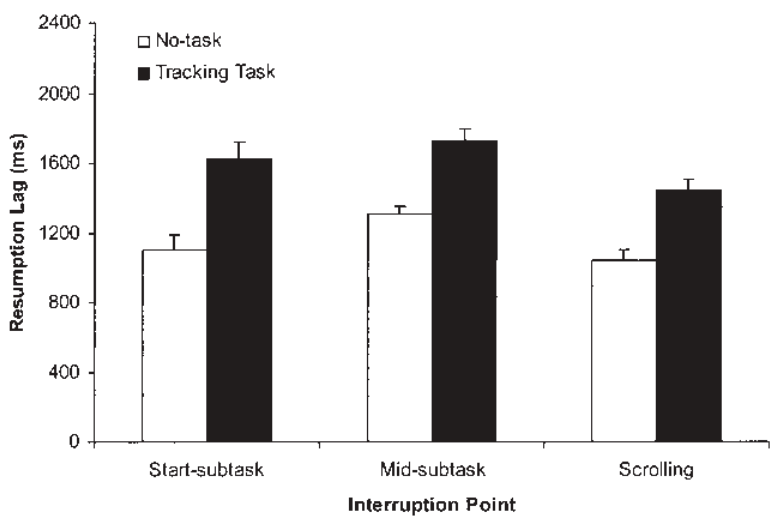
Later in the paper there are other references on distractions and driving. (The following summary is based on a quick glance, probably less than one minute with each paper. I might have missed something. If I revisit this paper, this is the first place I would dig deeper.) Four references (1, 2, 3, 4) relating to signs and billboards were about visual distraction, not ongoing cognitive load. Another referenced paper examines how long it takes to resume a task. The following figure gives a sense of the scale of the delay; the time on the vertical axis is in milliseconds.
That leaves one paper to support the argument of an effect of any substantial duration. A study in Finland found that a sign warning of slippery road conditions reduced the mean speed by 1–2 km/h over the following 360-1100m. A sign recommending an 80m distance between cars reduced the number of cars with a short “headway” between them. This Finnish study doesn’t have a great experimental design for ruling out confounds, as it’s a simple before and after study at three sites. But I’m also not convinced that we can extend a finding about behaviour in response to a warning of a slippery road to a claim about the duration of distracting cognitive load coming from a fatality count sign. The warning of a slippery road has a more obvious response.
Ultimately, there is little in the referenced material that supports the argument that these fatality messages are particularly distracting with an effect that lasts some minutes, except for the effect reported in this paper itself.
The authors point to a few specifics of the empirical evidence that might support their argument. One is that more accidents occur later in the year when the number of deaths for the year to date is larger. A bigger number leads to a bigger effect. But I’m not convinced that people have sufficient sense of scale for the effect to work like this. Are people so scale sensitive that a message about 1000 people in the second quarter of the year has no effect but 2000 in in the third quarter does? If I were to dig through the behavioural literature on how people respond to scale, most would suggest that we are often scale insensitive.
Another piece of evidence they cite is that there are more multi-vehicle accidents, with no change in single-vehicle accidents. This feels like after the fact story telling. I could imagine that if the effect was the other way around, with single vehicle accidents more common, they could equally have crafted a story that supported the hypothesis. Absent a pre-analysis plan with this hypothesis, it does not add any weight for me.
When trying to come up with reasons why the effect could be as large as reported, I thought of a few, but nothing that the authors had not already considered. In the supplementary materials, the authors tackle a range of alternative hypotheses as to what might be causing the accidents. Most seem feasible, but the evidence presented against each alternative points to the authors’ preferred hypothesis. For example, the first I thought of was that the messages with the number of fatalities were displacing more important messages, such as a message that there is an accident or hazard on the road ahead. But this was not the case, as traffic authority staff are instructed to prioritise critical messages. It does leave open the possibility that there is an effect due to displacing useful generic safety messages - the paper cited above on the slippery road warning is one example - but that supposes a much stronger effect for those than the evidence seems to support.
As a final note, there is one alternative hypothesis that the authors don’t mention: that the effect is just chance.
Updating my beliefs
One unfortunate fact about reading a paper with a claim you have not thought about before is that you can’t unread it. You can no longer determine what your prior belief was as to the probability of the claim being true. What was my belief before reading the paper as to the probability that signs with fatality counts increased crashes? I don’t know.
If I had to estimate the probability that a randomised controlled trial involving the use of fatality counts would find that they increased crashes by 4.5% or more, I’d put it at around 3%. If I had to guess my prior belief before reading this paper, I’d say around 1% - but I am of course completely making that up. For an effect size of greater than 1%, I’d put my current belief at around 10%.
So, the result of this paper could be seen as a large update - I’ve tripled the probability that an effect of the size found could exist - or a small update of only a few percentage points. That feels about right to me for a single paper in the context I described above. If a consistent literature started to accumulate - particularly via a pre-registered randomised controlled trial - that belief would change fairly quickly.
Some concluding thoughts
Having stated above that you should assess literatures, not individual papers, I also feel that authors should write their conclusions in the context of those literatures rather than taking their paper as providing the sole conclusion.
Take this dot point from the Research Summary:
Displaying death counts causes crashes.
What they mean is “we found some evidence in one dataset that displaying crash counts may cause crashes.”
Similarly, due to the effect persisting across years, they write:
People don’t habituate to nudges.
I feel that’s a bit like stating that the average effect size of a nudge is 0.43. Across the huge body of interventions that might be called nudges and the growing literature on habituation to nudges, this blanket statement based on a single study seems to be gross overreach.
What would be a strong claim that could be made from this paper? Given other research on safety messages, I would feel comfortable stating “there is no evidence for a short-term beneficial effect of fatality count messages”. If I was writing in a non-academic publication, I’d even feel comfortable writing “Fatality count messages don’t save lives.” But kill people? That’s a step further than the evidence to date justifies.
One final observation is that I dislike the reporting of large effects as point estimates rather than confidence intervals. If you look in the supplementary materials, you can find the information required to calculate that the headline 4.5% increases in crashes has a 95% confidence interval of [0.8%, 8.2%]. That’s more informative that the point estimate. In particular, it gives a sense of the uncertainty under the chosen modelling assumptions.